

With January 2012 poster selection leaving a lot to be desired—dump month movies don’t appear to get the same marketing budget as critical darlings—we’ve decided to better spend our monthly entry with the past year’s greats.
You won’t see any text on faces a la The Adjustment Bureau, In Time, or Warrior gracing this list nor that fantastically framed Mission: Impossible – Ghost Protocol poster that just missed scoring a spot. Instead there is a lot of white space and the fearless exclusion of celebrity faces. Originality reigns supreme and the realization it was a pretty darn good year for one-sheets prevails.
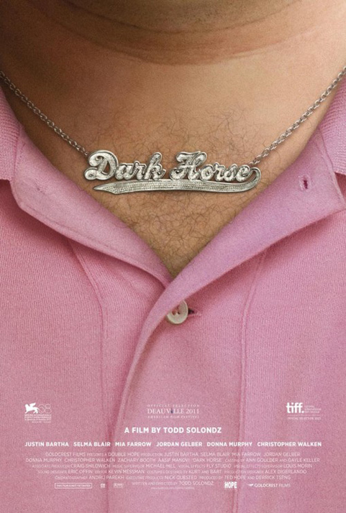 | 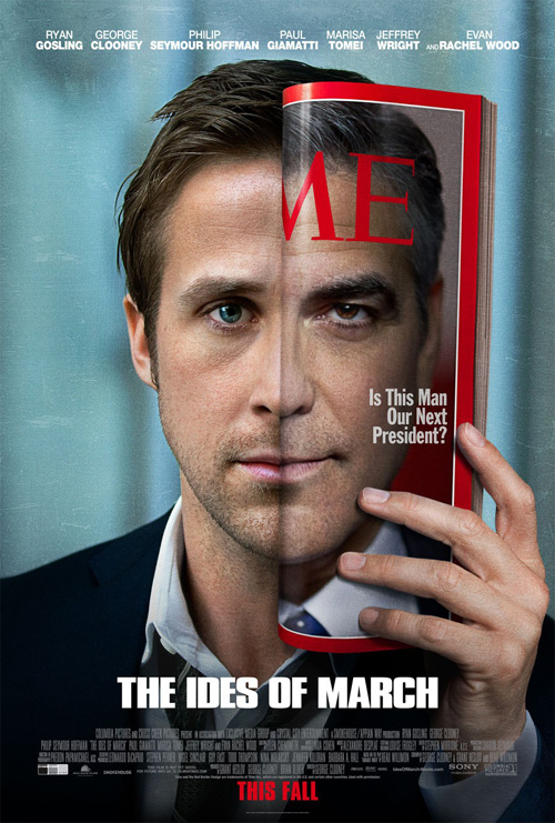 | 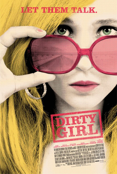 |  | 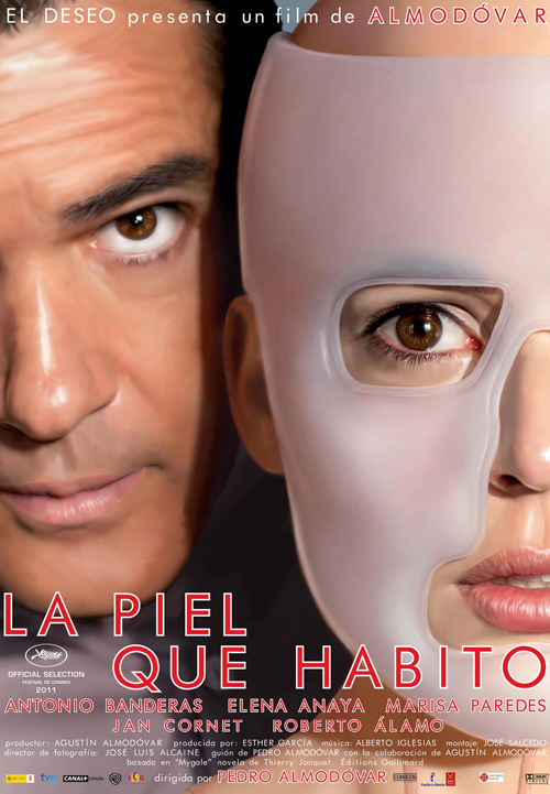 |
Dark Horse Mojo | Ides of March Ignition Print | Dirty Girl cold open | One Day Mojo | The Skin I Live In Juan Gatti |
—
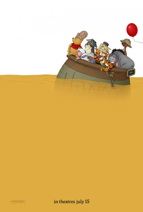 |  | #10 Winnie the Pooh The Arterie When you’re as iconic as Winnie the Pooh, Rabbit, Piglet, Owl, Roo, Kanga, Tigger, and Eeyore, text is unnecessary. Taking a page from George Washington crossing the Delaware, these childhood favorites of mine sail through a page of honey on their way to start a new adventure. Two-thirds devoid of anything but the solid murky yellow sea telling us exactly where to keep our eyes affixed; The Arterie shows that some firms out there still have the capacity to refuse pandering to the status quo. |

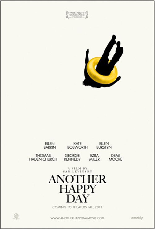 | | #09 Another Happy Day Showing off even more gorgeous white space, the falling silhouette of a limp and motionless man perfectly contrasts the adjective of the film’s title. Enclosed by a yellow intertube to give the one-sheet a glowing flourish, the feeling of malaise as the bottom literally drops infers an emotionally resonant metamorphosis to express what went wrong. We don’t need Barkin, Bosworth, or Burstyn showing us faces wrought with pain or joy, the subtlety of composition does it all. |
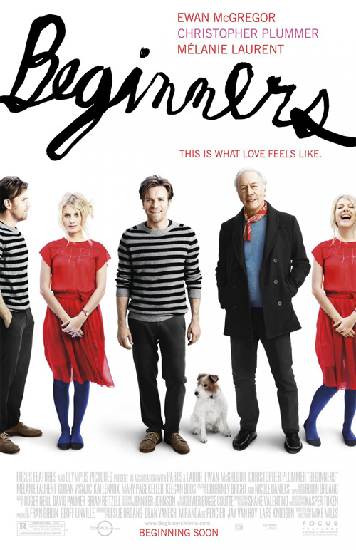 | | #08 Beginners Mojo / Mike Mills A charming poster for a charmingly delightful film, the use of a scrawled cursive font gives a quaintness mirrored in the artwork drawn by Ewan McGregor‘s character. With little details like ‘Beginning Soon’ at the bottom elaborating more on the title as well as the juxtaposition of pensive and happy amongst its stars, a sense of the dramedy’s ability to make you laugh and cry at will emanates forth. The only thing that could make the advert better would be a dialogue bubble coming from Cosmo the Jack Russell’s head asking if we’d please buy a ticket. |
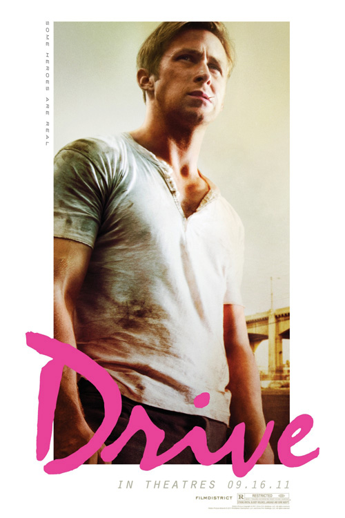 | | #07 Drive The Refinery What better way to portray a film that exudes cool at every turn than a James Dean-esque larger-than-life visage of star Ryan Gosling? Chomping on a toothpick with the sort of thinking man’s sternness he can barely let disappear when hanging with love interest Carey Mulligan and her son, the dirt-streaked mechanic’s thousand yard stare only shows the troubled soul beneath. Topped off by a hot pink title treatment in a font that could be used on a lipstick commercial and The Refinery simply has no fear. As stylish as the film itself, this image is as iconic as it gets. |
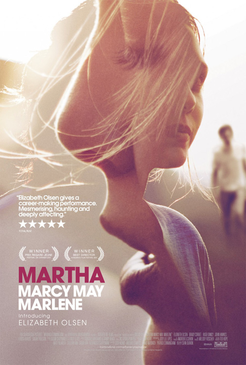 | | #06 Martha Marcy May Marlene Empire Design A movie dealing with dream and memory seeping into reality, the use of an ethereal transparency is a stroke of genius. A similar style to the likes of The Girl with the Dragon Tattoo and A Dangerous Method from this year, this entry is the only one combining its images in a precisely measured composition. The meeting of neck and shoulder from one Elizabeth Olsen kisses the curve of a second’s cheek as wisps of hair flutter in the wind. Sexuality and mystery fuse with the dangerous blur of John Hawkes lumbering behind—it’s a puzzle as intricate and yearning to be solved as the film itself. |
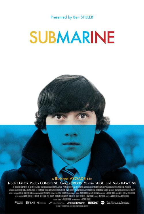 | | #05 Submarine Like the title’s metaphor for a family drowning underwater from the painful depression waiting on its surface, this one-sheet’s visual representation of the same is both succinct and exacting. The wide-eyed awkward stare Craig Roberts gives throughout the film is on display, color stripped down to a blue tinted Xerox-like contrast of black. A periscope above water watching his parent’s marriage dissolve and the emotionally stunted neediness of his girlfriend leading him along, the poster is all about Oliver Tate. Stamps of bright colors on white like the sharp bursts of dry comedy through a methodically paced droll coming of age tale, minimalism enhances like excess never could. |
 | | #04 Pariah Mojo Captivating in its crop, clean in its fully justified text block at center, and stunning in its unique character. Adepero Oduye‘s face expresses the sorrow, isolation, and humanity of Alike that a Photoshopped montage of actors or a hipster pen and ink drawing could never capture. Mojo really hits a home run here to cement the firm’s fourth inclusion to this list with superb artistic intelligence. When you’re creating a vertical piece to represent a horizontally widescreen medium, it takes a peerless vision to make the transition seamless. |
 | | #03 The Artist Black and white and silent, this is a film from a past generation renewed earning a resounding “Yes! More, please!” from the public lucky enough to have seen it thus far. Stripped down bare to the essentials of what makes cinema great, the poster aligns perfectly with its black abyss cut by a brilliant white chiaroscuro of an adoring duo in love. There is a magical aura surrounding the faces that draws you in and the old fashioned thick to thin stroke of the tall font at bottom to help instill a tone of yesteryear. With the single piece of color standing between image and text beautifully, it only makes your eye travel its loops back to the top’s striking example of love’s purity. |
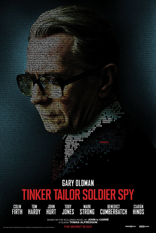 | | #02 Tinker Tailor Soldier Spy Ego Communications An amazing series of character posters doing their job so well that Ego Communications didn’t see the point in creating a singular piece to lord over them, their use of code to create its image is brilliantly conceived. With extremely tight leading and kerning, the numbers and letters are sized to perfection and allow all shadows and highlights of their dramatic portraits to be retained. It’s simple, direct, and so good that its American counterpart tries hard to copy it with much less success. A film of intrigue and espionage, the contemplative looks portray its thriller aspects and the mysterious strands of code another puzzle to solve. |
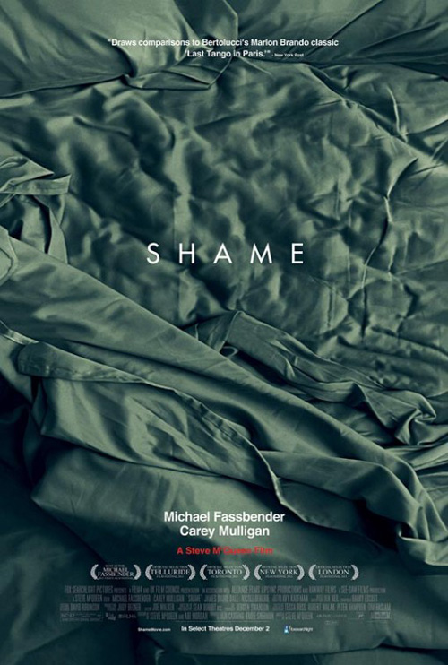 | | #01 Shame Mark Carroll Mark Carroll understands this film and the import of its lead actor Michael Fassbender‘s need to hide his desires. A performance of unparalleled bravery, only an advert with equal amounts of courage could think about representing it with a single image. NC-17 and widely discussed among cinephile circles, what better way to feed into the hype than a poster refusing to show even one frame? An empty bed made dirty, personal, and embarrassing by the title’s directness, it only enhances its secrets by keeping them out of frame, begging to be discovered. Credits: Text & Image : The Film Stage |
No comments :
Post a Comment